Torsion
I was responsible for the logo, visual direction, and 3D assets for Torsion. The identity needed to combine the concepts of torque and the Kozyrev mirror with a retro PlayStation-inspired aesthetic. My work included sketches, vector development, animation, and low-poly asset creation.
00

problem
Torsion needed a visual identity that referenced complex ideas (torsion, rotation, time-chamber geometry) without turning into a literal diagram. At the same time, the brand had to feel nostalgic and playful while still working cleanly on modern screens.
solution
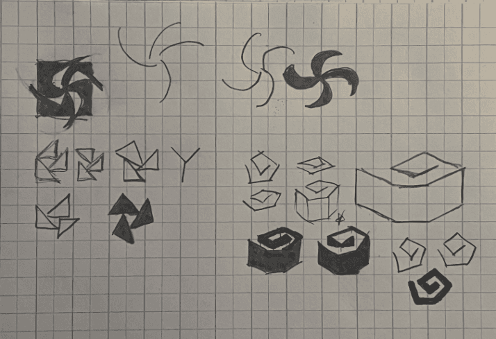
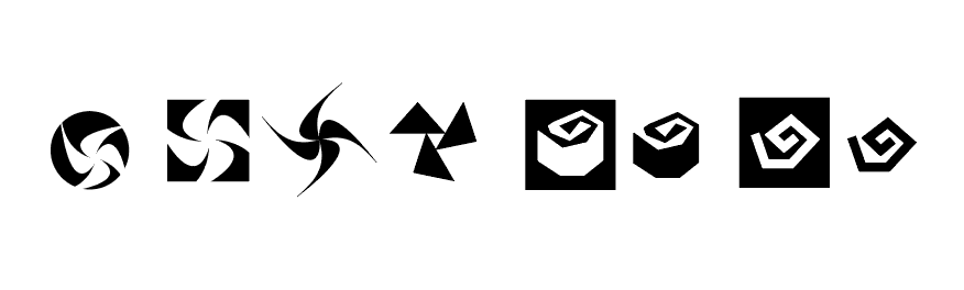
I simplified the Kozyrev mirror into an angular, wrapped shape that suggests motion, rotation, and torsion. The logo uses sharp edges to match retro PS1-era visuals. I then created low-poly 3D assets using custom shaders and minimal geometry to reinforce the retro aesthetic while staying functional for the website.
This project was about translating abstract physics into a visual language people could instantly connect with. The Kozyrev mirror isn’t a familiar symbol to most, so the challenge was capturing its core idea: rotation, compression, directional flow, without relying on a literal technical diagram. Once I reduced it to a wrapped, angular form, the identity gained a clear foundation: everything in the brand “twists” or “moves” in a controlled direction.
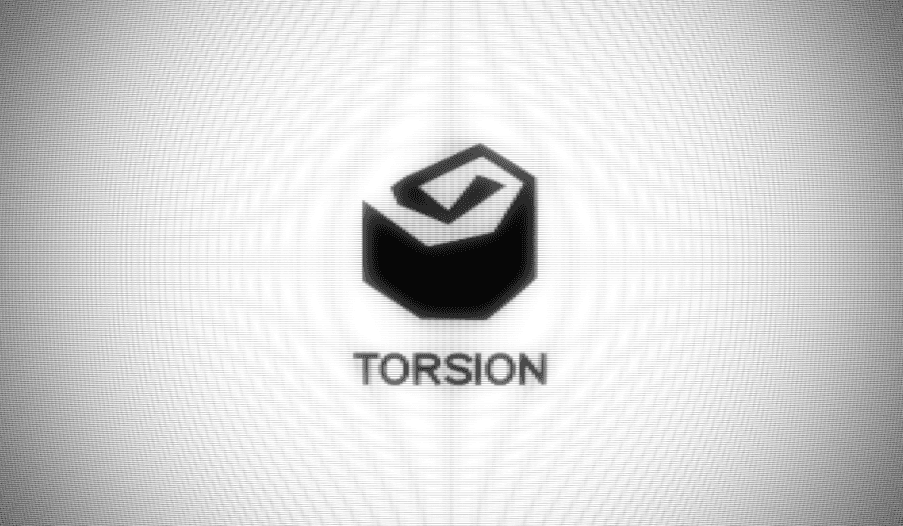
The retro PlayStation influence added another layer of intention. Instead of mimicking old hardware for nostalgia’s sake, I treated those limitations as design rules: sharp silhouettes, low-poly geometry, simple materials, and animation timing that felt slightly “mechanical,” like early startup screens. That constraint made the brand feel cohesive across sketches, vectors, the final logo, and the 3D assets.
What made the project satisfying was how the scientific concept and the retro aesthetic started supporting each other. The Kozyrev-inspired shape already had geometric tension; the PS1-era influence made that tension feel stylistically natural. By the time I reached the 3D assets, the visual language was strong enough that even simple objects — a coin, a piggy bank, a membership card — felt like they belonged in the same world as the logo.
Overall, the identity works because it’s grounded in a clear idea: motion + geometry + nostalgia. Everything points back to those pillars, and the final brand feels intentional without being overdesigned.
01

02

03

04

see also