I worked with Torsion to create a logo, and assets to assist with the visual direction of the company.
The visual concept of the company was to incorporate retro game aesthetics, similar to the style of the original PlayStation games. By implementing this concept to the entire brand, this invokes the feeling of nostalgia, creating an immediate emotional connection and a distinctly playful identity.
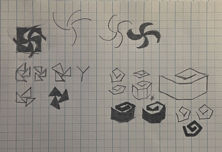
" sketched logos for Torsion "
For the logo, I was requested to have it include relations to the movement of torque, the Kozyrev Mirror experiment as it relates to time travel, as well as the retro game aspect.
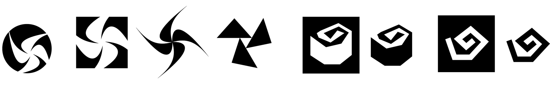
" vectorized icons from sketch "
With several choices to go with, I believed going with the shape of the Kozyrev mirror would be a solid decision as it resembled the movement of torque, while minimizing the use of curvature but rather sharp and angled edges to remind one of the graphic aesthetics of a PlayStation.

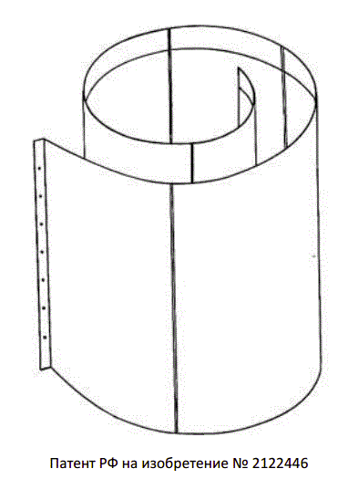
" Left side: Torsion icon with box. Right side: A diagram of a Kozyrev mirror. "
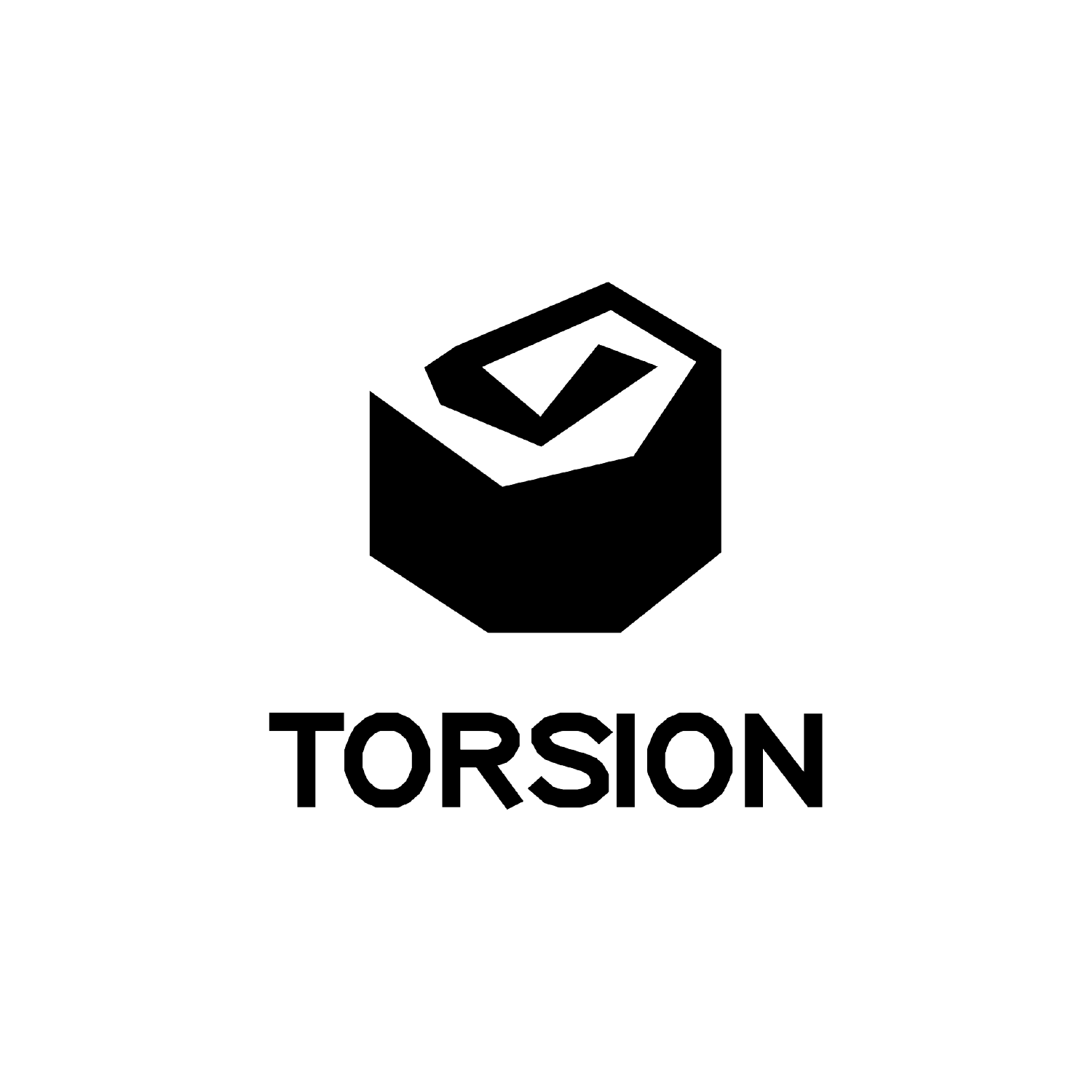

" final logo and 'start-up' animation, slight reference to the GameCube start-up. "
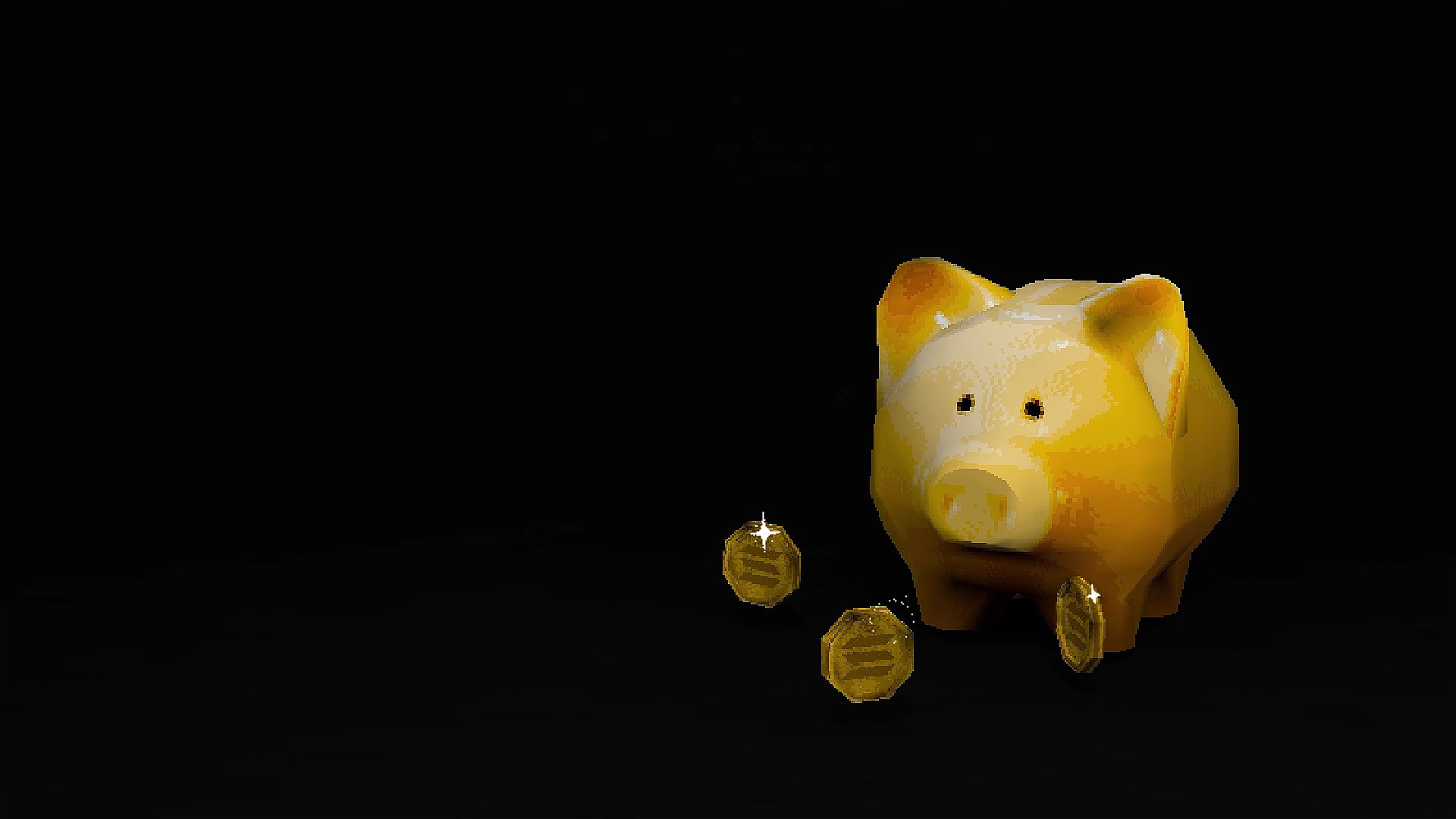
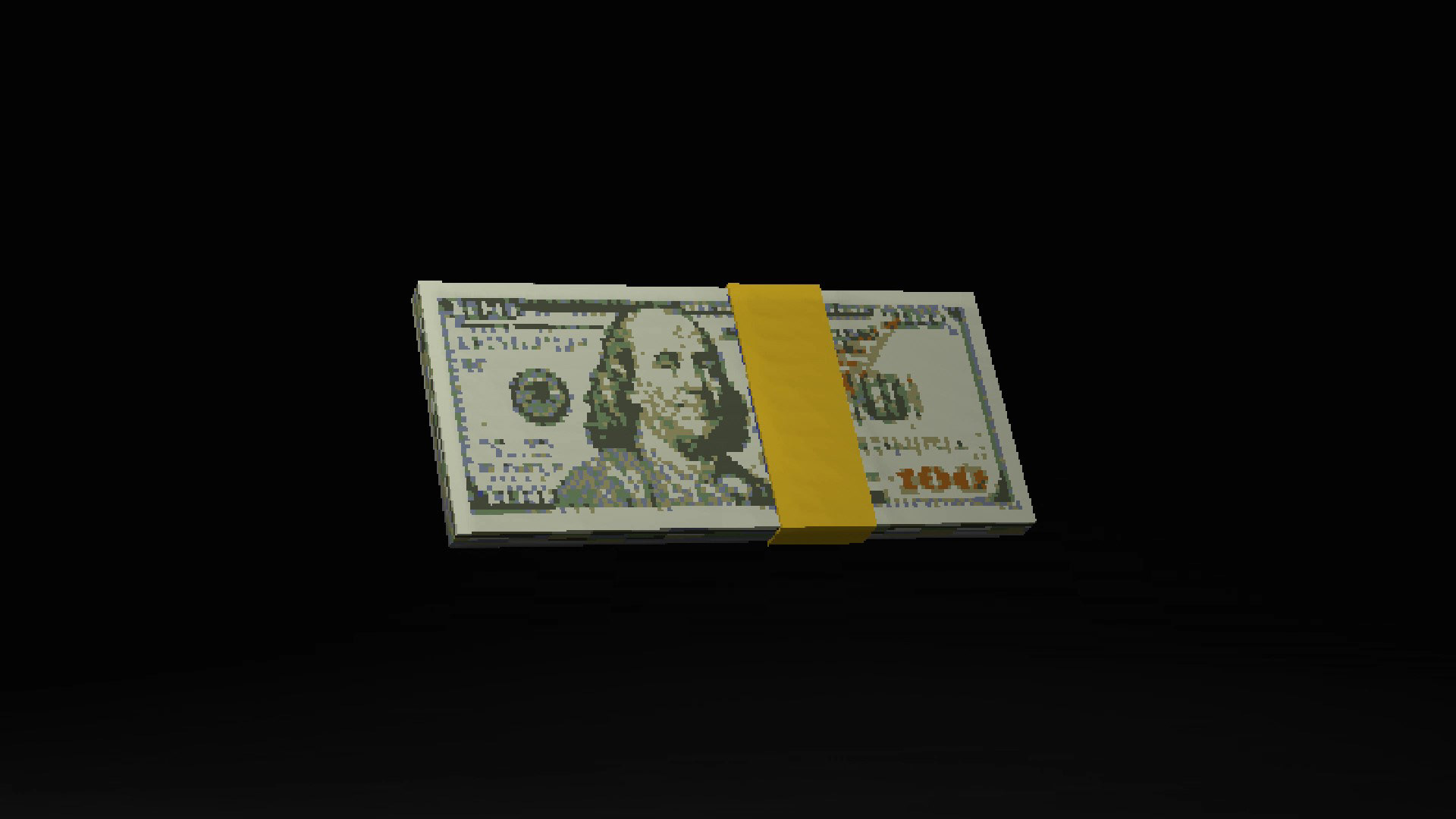
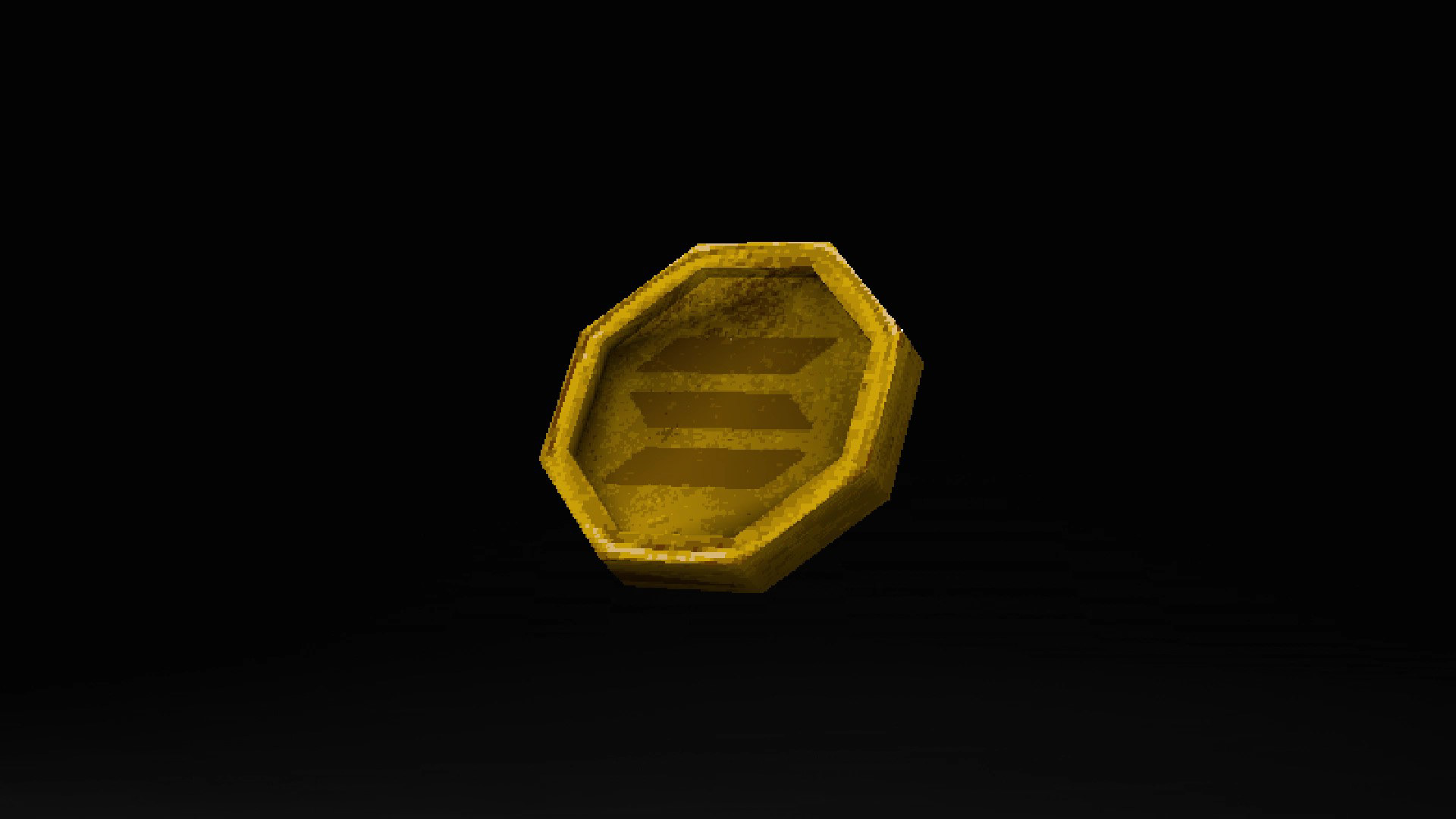
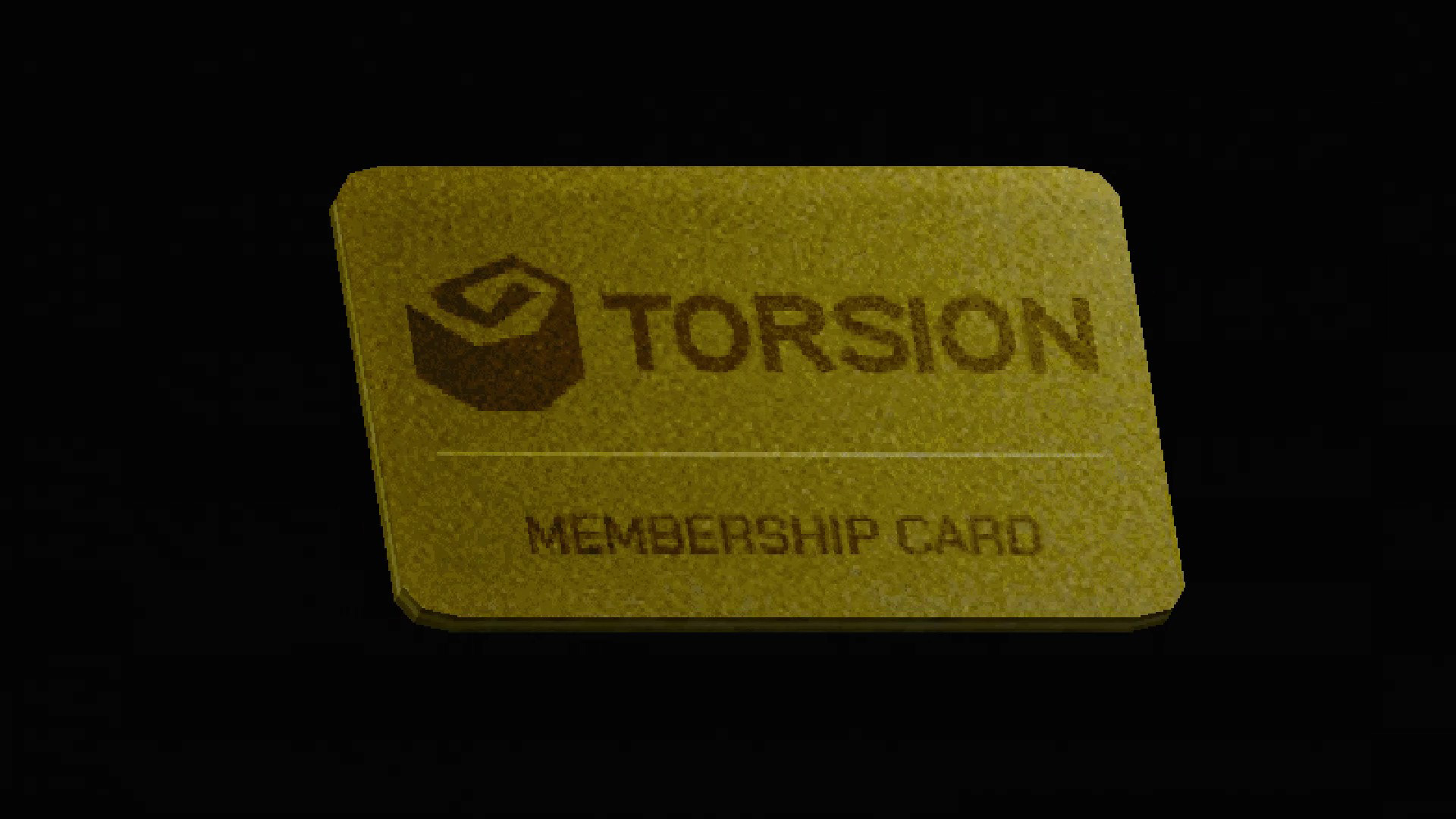
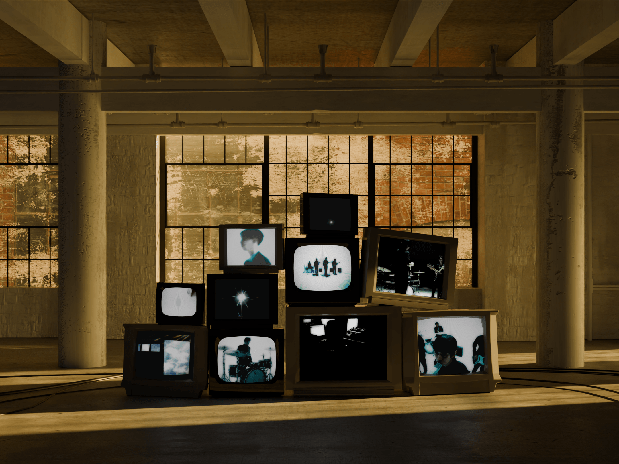
" screenshots of animated assets for Torsion website "
Creating the assets was simple due to the minimal poly count, however difficult due to the custom material nodes. Each asset had a specific reason and use for the website, as well as giving the retro aesthetic as requested.